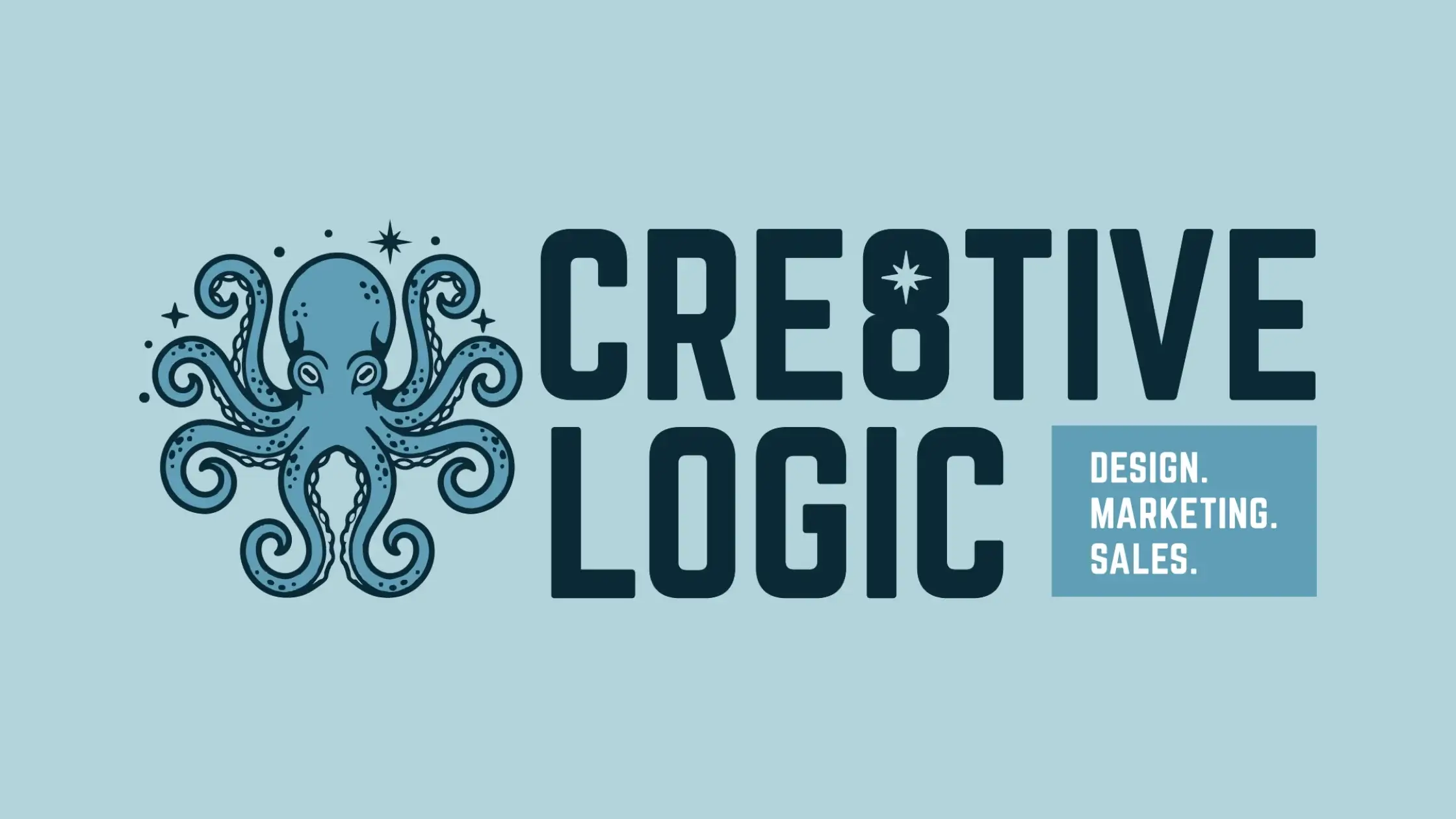

When we decided to refresh the Cre8tive Logic brand, we knew we wanted something that carried more personality. We wanted a symbol that didn't just look good on a business card, but actually told the story of who we are as a team. Enter: The Octopus.
Octopuses are among the most intelligent and strategic creatures on the planet. In an industry like ours—where we are constantly balancing design, marketing, and sales—that level of adaptability is essential. The octopus represents our "all-hands" (or all-arms!) approach to helping our clients thrive.
The connection was natural. With eight tentacles and eight "lights" in our new brand illustrations, it’s a perfect play on the "8" in Cre8tive. It serves as a visual reminder of the multifaceted nature of the services we provide to businesses in York, PA, and beyond.
Perhaps the most important detail is the North Star, tucked subtly into the center of our new "8." This is our "Mission Star." It represents our promise to never lose sight of the "why" behind our work. In every campaign we launch and every brand we build, that star guides us to stay true to our clients' core values and objectives.
Discover how our strategic "all-arms" approach can reshape your brand’s identity. Contact us for a consultation today!
This rebrand marks a new chapter for Cre8tive Logic. We are leaning into our personality, our strategic roots, and our commitment to being a guiding force for businesses. The power of our story is not just about what we say, but how that "Mission Star" guides every result we deliver for you.